How to choose your colour palette and fonts for your website?
Introduction
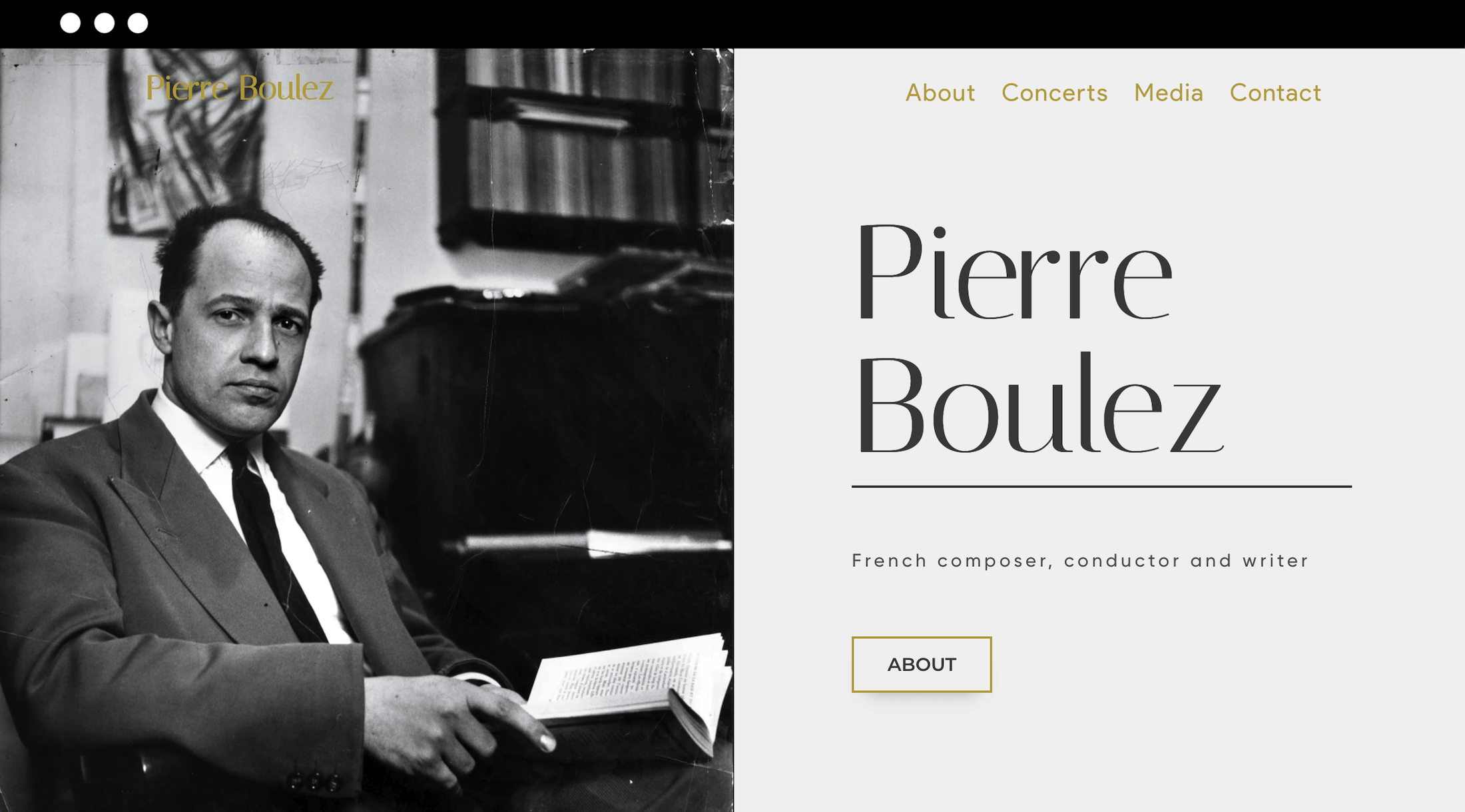
The colors, typography, and imagery that go into your website design are the building blocks of your online brand. These elements can help convey who you are, and what you stand for, to your target audience.
Whether you’re new to website design or revamping an existing site, learn how to create a signature style without hiring a web designer.
1. Choosing a color palette
When you’re choosing a color palette for your website, spend some time looking at other brands or portfolio sites for inspiration. If you’re launching an online plant shop, for example, you might look at competitor brands to see how you can differentiate the look and feel of your online store and stand out in the marketplace.
Color also plays an important part in the user experience of a site, and finding the right color combinations is central to good web design. For example, choosing a color palette that makes the CTAs on your website obvious will also make your site easily navigable for new visitors. There are five main approaches for picking colors:
One of the most important things to consider when creating your website is how you will use it. You need to decide what types of content will be included on your website and how you’re going to use that content for marketing purposes. If your goal is simply to share information about yourself or your music, then a simple blog or portfolio site may be enough.
-
Complementary colors: These are opposite each other on the color wheel; such combinations include a warm color like yellow juxtaposed with a cool color like violet.
-
Split complementary colors: This splits one color into its two adjacent colors on the color wheel and then matches that pair with the original color’s complement; for example, you might split red into red-orange and red-violet, then pair them with red’s complementary color, green.
-
Triads and tetrads: Any three or four colors, respectively, that are the same distance apart on the color wheel, e.g., red, blue, and yellow (triad), or orange, red, violet, and blue (tetrad).
-
Analogous colors: These combinations sit next to each other on the color wheel, e.g., red, red-violet, blue-violet, and blue.
-
Monochromatic colors: A single-color scheme that uses various shades, tones, and tints of an individual color.
When you’re selecting color combinations, keep it simple and limit the number of colors you choose. As a rule of thumb, stick to three or four main colors at the most. Some websites propose to create easily color palettes to facilitate your choice like Coolor or Adobe Colors.
2. Selecting the fonts for your website
Like color, typography informs our opinions and shapes the way we feel about the businesses we interact with. Here are some of the different styles of fonts you can choose from. You can use Dafont or Google font to help you in your choice.
Serif fonts
These classic typeface styles have a decorative foot (i.e., a serif) at the end of each character’s stroke. Examples include Times New Roman, Palatino Linotype, or Georgia. They’re great for long blocks of text, like body copy on your website, and have a formal, authoritative quality to them.
Sans serif fonts
“Sans” means without, so “sans serif” means a font that has no decorative foot. Examples include Helvetica, Arial, and Verdana. They’re modern, easy-to-read, and simple.
Slab serif fonts
Geometric, blocky, and confident, slab serif fonts are great for logos, headlines, subheadings, and even body text. They include Rockwell, Soho, Memphis, and ITC Lubalin Graph.
Script fonts
Script fonts look like cursive handwriting. They can be difficult to read in small format, but script fonts can work well on a landing page, as headlines or subheadings.